
Sometimes I wonder what medium to paint in…
I love both Pastels and Oils – if I’m honest I love that pastels are quick, but I also love that oils slow you down (by waiting for layers to dry) so that you can contemplate the next steps, I know this is a bit of a contradiction… welcome to my mind!
Interestingly with both Pastel and Oil I use the same layering techniques.
This got me thinking…
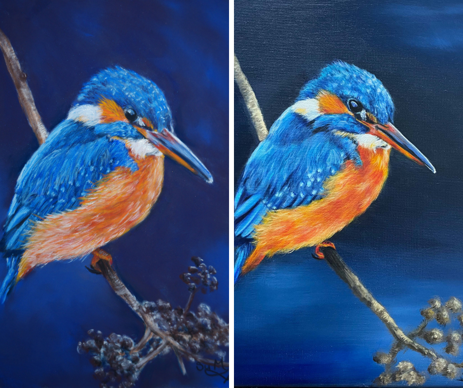
What if I painted the same image in both mediums and see what the difference is both in process and visually for the end product – a plan was formed!
First to pick an image that I would want to paint twice.
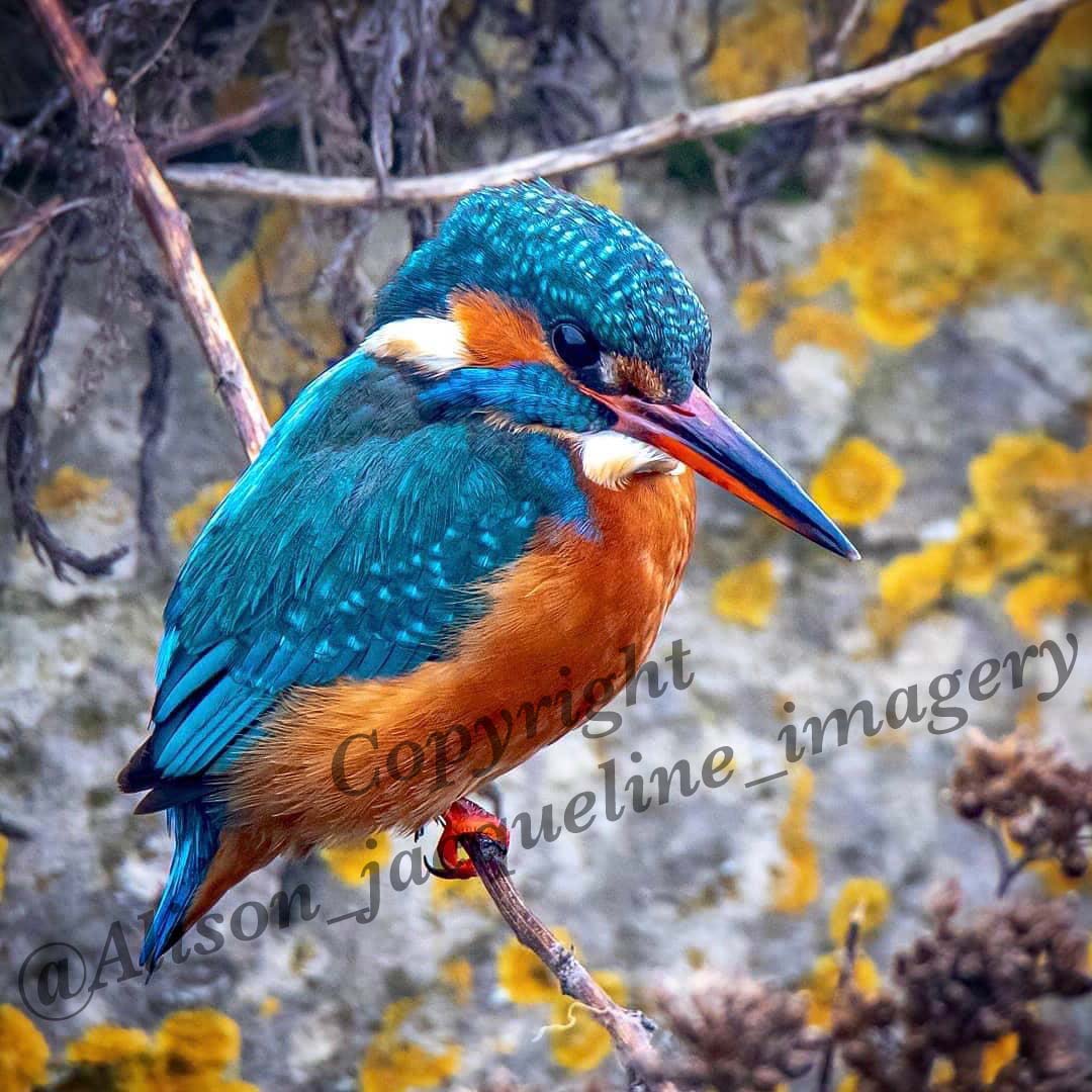
I saw this gorgeous Kingfisher taken by the wonderfully talented Alison Jacqueline Photography (those of you who have seen my pastel art kits will know that Alison took the gorgeous Robin reference photo!) and approached Alison to buy the image – you know my stance on this, creativity isn’t charity – if we want creatives to thrive we need to pay them for their talents!
I loved the blues and had some wonderful shimmering pastels and a gorgeous neon orange oil that I was itching to try out!
Now that I had selected my image it was down to the painting…
Royal Blue – Pastel

Firstly the pastel painting, I wanted to play with my new shimmering pastels from Henry Roche and oooh they are good – although the diamond shimmer did leave my studio looking like an explosion in a glitter factory, so I’m glad I didn’t start the oil at the same time!!
I also used my favourite Unison pastels too – they have such a fabulous depth of colour!
I think the pastel painting has an atmospheric feel to it, and the shimmer (which doesn’t show on the photograph) gives it a magical touch.
Royal Blue – Oil
Secondly the oil painting, I knew this would take a lot longer and it did – not just in drying time but also execution, interestingly as the process slowed me down I was more mindful of the marks I was making.
For the oils I used Michael Harding oil paints with the wonderful neon orange by Langridge.
The oil painting is more vibrant and I was able to achieve the layered feathers easier – it did take literally more than a month more though!

I rather enjoyed this experiment, even with the same reference photo, and trying to have the medium as the only difference, both paintings have an individual feel!
I couldn’t name them differently (I am consistently rubbish at coming up with names for paintings!) so they are both “Royal Blue” in homage to the wonderful colour of these little birds and the fact they are kings!
Which do you prefer?
Have you used different mediums with the same reference photo?
Su x
p.s. you can join me on a workshop here or buy a pastel art kit here too!